
SEPA Instant Payments
AIB Personal Mobile App
Overview
The European Payments Council (EPC) mandate for the SEPA Instant Credit Transfer (SCT Inst) program set a clear deadline: October 2025.
This mandate was a fundamental shift toward real-time banking across Europe, meaning that AIB needed to evolve its core payment services.
As the Lead UX/UI Designer, my overall goal was to manage this massive regulatory requirement by integrating the new instant capability seamlessly into the high-traffic (2.2 million users) AIB Mobile Banking App.
Rather than creating a standalone feature, the project required a comprehensive redesign across five existing, critical payment journeys:
Open payments to a new payee
Payments to a saved payee
Bill payments
Credit card payments
Transfers between own accounts
Every path a user could take to move money had to be redesigned to incorporate and clearly communicate the new instant speed, and all of the sub-regulations that came alongside this mandate.
The instant speed of payments comes with great convenience, but also introduced new security requirements that added additional journey designs and redesigns:
Verification of Payee (VoP)
During payments and managing payees
Giving customers a choice (Instant payment vs old school bank transfers)
Allowing customers to set their own limits
Since errors would become irreversible in seconds, these new precautions were required to go live with SEPA instant payments to give more thorough protection to users before and during payments.
This expanded the scope to include thoughtful adjustments to the existing payee management hub and the creation of new app settings controls, allowing customers to personally manage their new SEPA Instant limits by transaction or daily limits.
So this brought me to the question: How can we make these instant payments feel seamless, but also safe?
Role
Tools
Timeline
Lead UX/UI Designer through the end-to-end process: discovery, defining, wire-framing, designing, prototyping, user testing and iterations throughout testing and build.
Figma
Lookback
Dovetail
Jira
Overall: 14 months
Problem
Existing SEPA payments are slow and behind the curve in today’s world where speed is the expectation.
To keep AIB in a competitive space, we needed to meet the SEPA Instant mandate deadline without compromising our existing payment journeys or increasing the risk of fraud on our customers.
Solution
Integrate SEPA Instant functionality, and all the regulations that come along with it, into existing AIB payment journeys in a clear, minimal friction way.
Giving more control and information to the user before and during the payment process allows the user to be more protected and secure before making their payments, giving them the best of both worlds — instant payments and security.
Process
Discover
Current state process maps
To understand the best way to integrate SEPA Instant, I first needed a full scope view of the journeys that would be affected.
I created process maps for the core payment journeys that would be affected by the mandate. This involved detailed mapping of those flows and pin-pointing customer actions, back-end information, where new information/items may need to be added and any additional relevant information.
This analysis ensured the redesign would minimise unnecessary disruption to established user habits.


Benchmark analysis
To inform the design strategy for VoP within the AIB app, I conducted a targeted benchmark analysis of the Confirmation of Payee (CoP) rollout in the UK, a comparable regulatory feature implemented for UK banks (including the AIB’s Northern Ireland app) shortly before the EU mandate. This comparison allowed me to anticipate user pain points and adopt proven UX patterns from the existing Northern Ireland app and find out what was working and what could improve.

User testing (July 2024)
Using Lookback to connect virtually with our users and Dovetail for note-taking, I completed initial user testing on our existing payment journeys to identify pre-existing gaps and trends with our confirmation of payee screens used for the AIB Northern Ireland app to understand initial reactions for any improvements to be made in our Republic of Ireland app.
Objectives
How do customers ave payees and why do they choose those methods?
Is the journey understandable and easy to navigate?
When do customers use international/out of country payments and why?
How do customers make international payments? What providers and why do they choose them? What’s important? Any barriers?
Are there any gaps other institutions are filling that we don’t provide (or don’t provide well enough) that we don’t know about?
Participants and duration
5 AIB customers aged 20-52
1 hour sessions
Device type
Mobile


Define
Problem statement
Under the EPC mandate for the SEPA Instant Credit Transfer, AIB needed to make updates to our payment journeys to adhere to the upcoming changes by October 2025. Primarily, this involved making SEPA instant transfers available throughout our payment systems. However, along with this mandate came sub-tasks and requirements to ensure we give our customers a faster, but still secure, payment option.
So, the question is:
How can AIB seamlessly integrate SEPA instant into AIB’s payment flows to increase speed while maintaining and maximising user trust and security?
Requirement prioritisation
The SEPA Instant program wasn't a single feature update, it created multiple, interconnected sub-projects that required careful sequencing and focus.
By breaking up and mapping out these requirements, it helped me to prioritise and track of each new design to ensure each must-have item is covered.
The key priorities included:
Integrate VoP into all eligible instant payment/saving a payee flows.
Creating a control hub for users to manage their instant transaction and daily limits.
Add the Instant vs. Standard option within the core payment journeys.
Update the confirmation screen with clear instant or standard messaging.
Update the payment logs to correctly display the new instant status and information required.
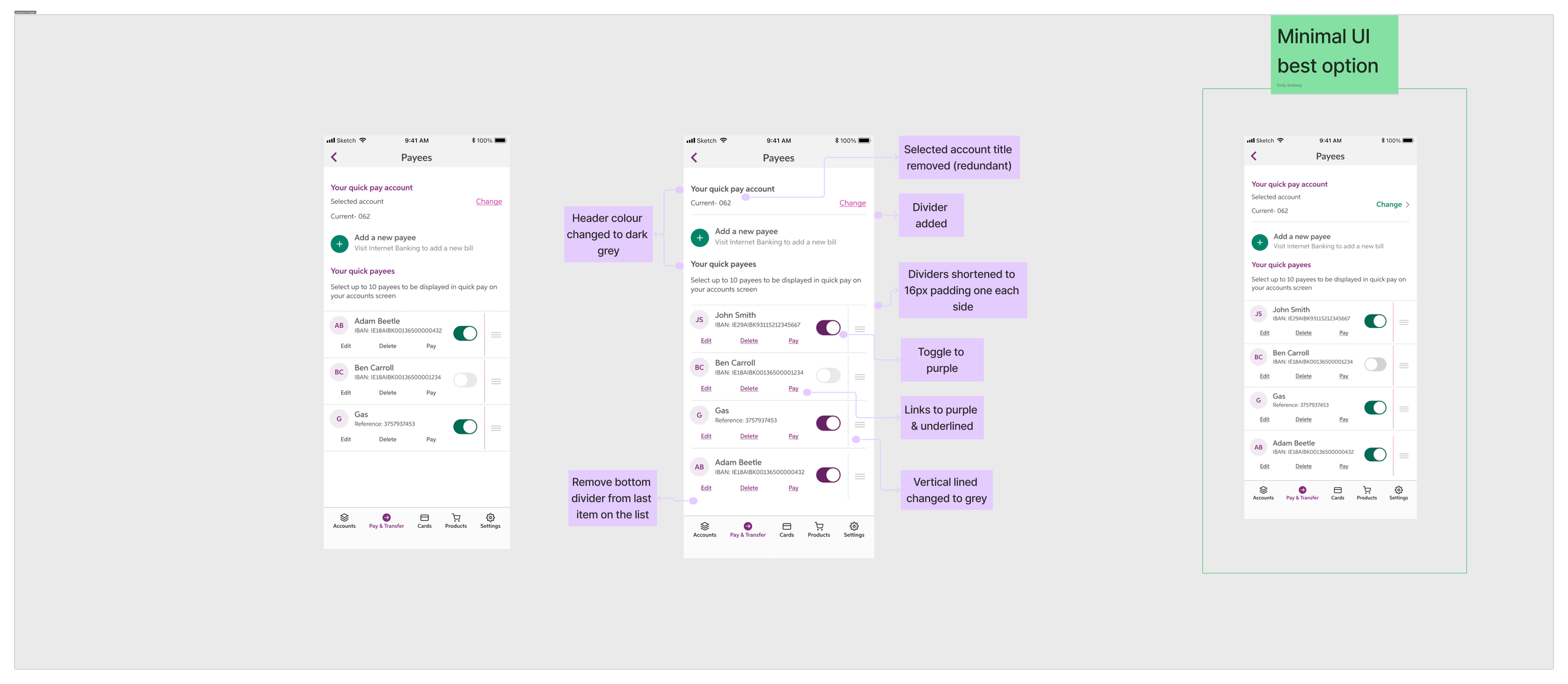
Another key requirement external from the mandate was that of re-using existing components in the AIB app as much as possible due to resourcing and timeline concerns with a larger scale conflicting project currently ongoing at AIB.
Stakeholder alignment
Bringing all key parties together early and often would ensure a unified product vision, streamline the approval process and guarantee the final design was both customer-centric and compliant.
After reviewing testing feedback and existing journeys, it was clear that SEPA instant would be the best option for and chosen option by our customers, with speed playing a major factor in payment priorities these days, and all payments with the option to be instant being defaulted to instant, rather than standard.
However, it was quickly understood that the legal and compliance teams were hesitant to support this change in the journey and were more in support of keeping the standard option as the default.
In attempts to sway the stakeholders in the way of what’s best for the customer, I presented to the stakeholder group with my interpretation of the mandate, example journeys, the proposal, and evidence to back up the proposal.


Ideate
Once I had all the requirements mapped out, I explored various design iterations for each sub-task in order to make the large project more manageable.
Instant vs Standard payments
The user needed a clear and reliable way to control the speed of their transaction. Below outlines my ideation process for integrating the Instant vs. Standard payment choice.
I explored various solutions — from dedicated radio buttons to contextual dropdowns — searching for the design solution that minimised screen clutter, clearly communicated the difference of the two, and ensured users could retain control over their payment preference without disrupting the core payment flow.

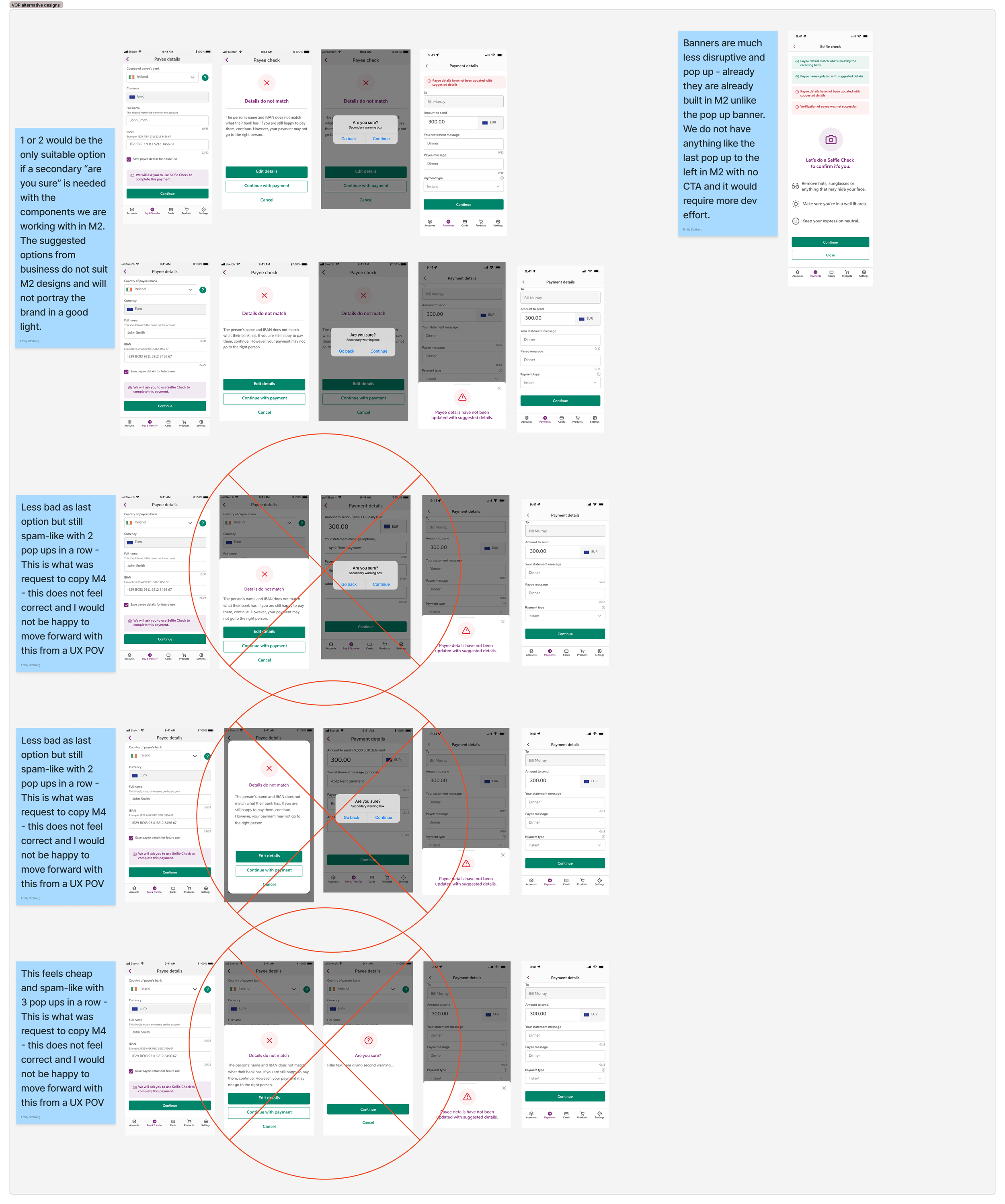
Verification of payee (VoP)
The VoP design solution had the most background research of all the sub-tasks thanks to the very similar Confirmation of Payee mandate completed the year prior for the U.K., which included AIB’s Northern Ireland app.
Using the base designs from the Norther Ireland app, I was able to speak with colleagues and test existing designs to identify any areas for improvement, pain points, or gaps.
The challenge was finding the optimal balance between providing necessary warnings and maintaining payment flow confidence, and considering error scenarios and edge cases.
I explored multiple solutions for communicating name match results (Full Match, Partial Match, No Match), ultimately focusing on using positive friction to guide the user, ensuring the security step felt like a moment of reassurance rather than a roadblock.

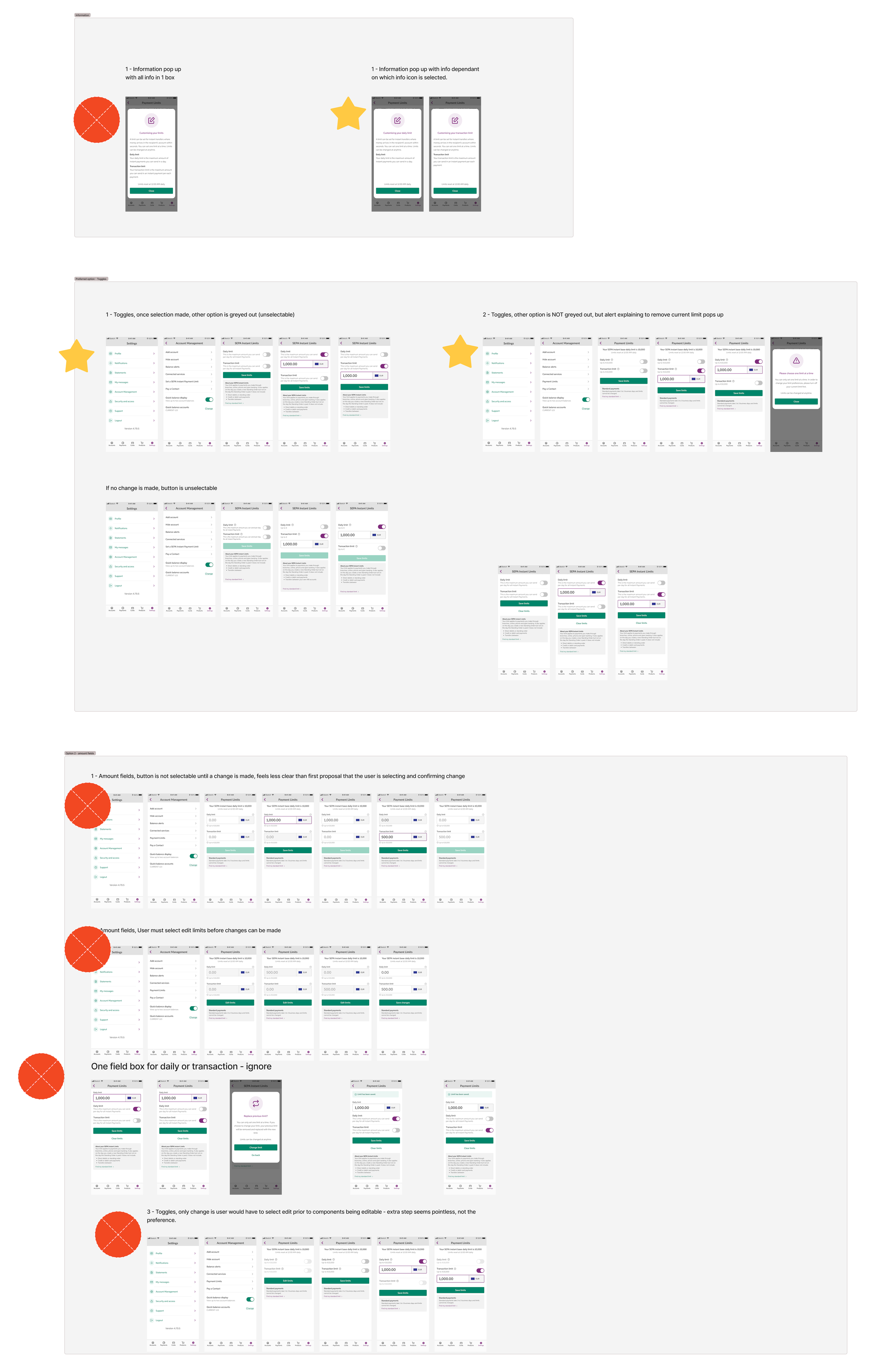
SEPA instant limits
The new instant speed of SEPA transfers required preventative and transparent risk management.
I explored solutions for a limits control hub to give customers more control over their security, allowing them to easily view, choose and create either a per-transaction limit or daily limit.
A challenge here, was intuitively designing the settings screen so that users would understand they are only able to have one type of limit at a time, due to technical restraints.
I tried out various solutions and chose the MVP from a UX perspective. I then presented the options during a stakeholder session, and we agreed on the MVP, with the exception of some wording updates.
Deliver
High fidelity design
Now that the smaller sub-tasks were outlined and the best solution for the customer was identified, I created a high-fidelity full journey map, knowing that the journey would need to be reviewed and all designs and content would need to be signed off by the wider stakeholder group, including legal, compliance, business, developers and tech leads.
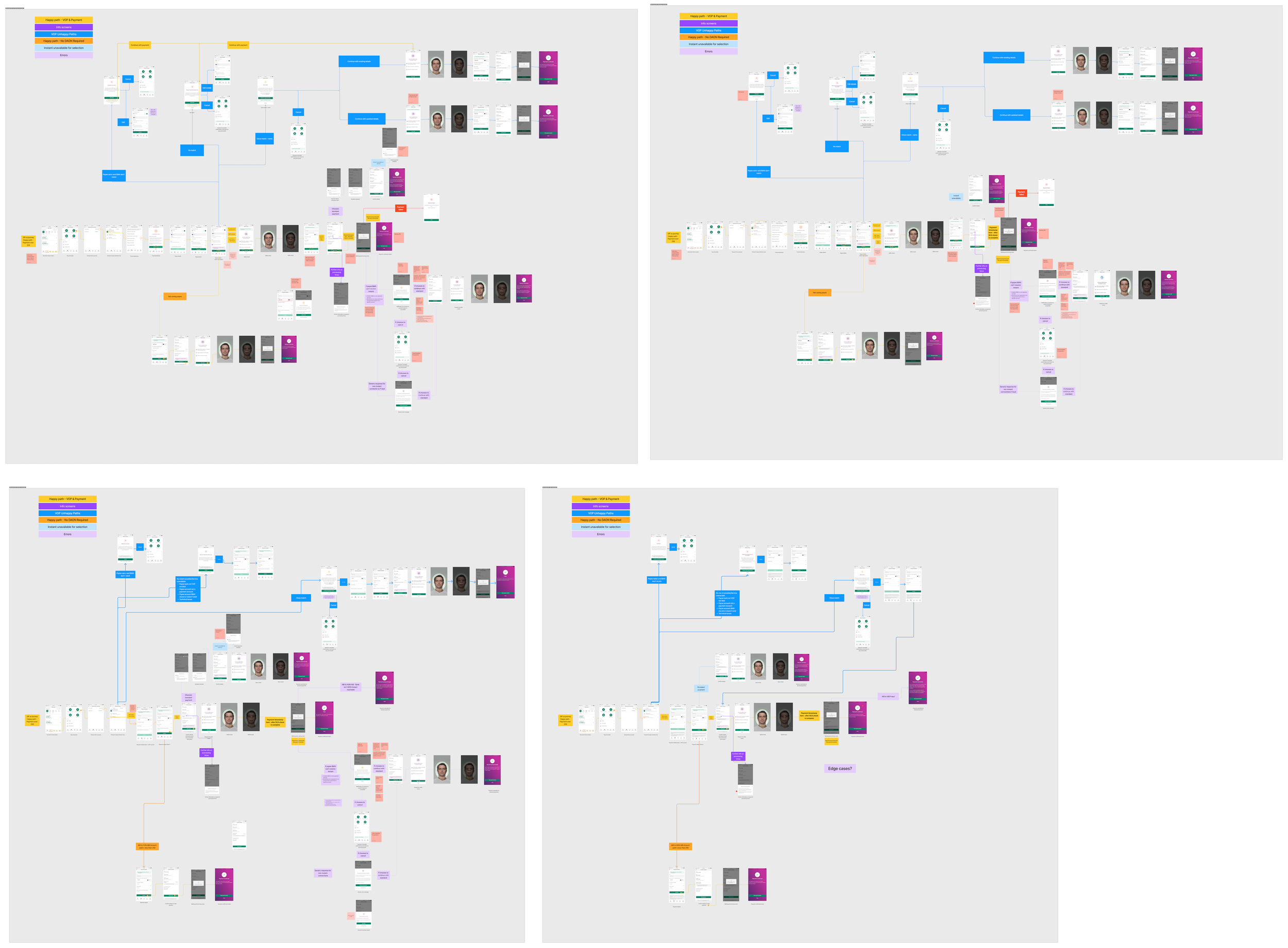

Stakeholder workshops
Once the high fidelity design journey map was built, it was clear that the complexity and vastness of the project required in-depth walk-throughs of the screens with wider stakeholder groups to ensure there was alignment from every team.
I planned and led targeted stakeholder workshops to secure sign offs and mark any points that were unclear, needed revision, or required more looking into from a non-design perspective.
These workshops served two main purposes:
Gaining compliance and legal sign-off
Re-validating technical feasibility with the entire flow working together
These workshops were held as early and often as possible, with the goal of creating the optimal design solution that still met deadlines, requirements and sign offs.

Challenges
The main challenge faced throughout the project was stakeholder alignment.
After initial requirement sessions with the wider stakeholder group, it was clear that various stakeholders were looking at the journeys only through their lens, rather than putting the customer first.
Compliance and legal teams were focused on meeting all regulatory standards from their interpretation of the mandate.
Engineering and architecture teams were focused on technical feasibility and resource planning.
Business leads were focused on meeting timelines and getting sign-offs.
The content lead and UX lead (myself) were focused on creating an optimised journey that would be both sleek and secure for the customer.
It took countless focused workshops over many months to come to agreements.
Within these workshops, optimised designs for the customer were presented, but often challenged by what was clearer or easier for the compliance and/or development team.
This was challenged back by me asking…
“Is that easier for us or the customer?”
Unfortunately, the workshops were ongoing for so long, that it started to dig into our development time, and allowed for only the bare minimum requirement changes in the end.
An additional challenge throughout the project was resourcing and timing was scare and many design changes had to be scaled back from their original optimal design.
Final design
The design updates that were used in the final design to meet the October 2025 deadline included:
Addition of the Instant vs Standard payment option in the existing native app dropdown menu style.
Creation of the SEPA instant limits section in settings.
Verification of Payee incorporated into all journeys in a similar design to the Northern Ireland AIB app, with updated wording and CTAs and a confirmation banner after the selection is confirmed.
Reflection
Reflecting on the SEPA Instant project, I found it to be a valuable learning experience for a project where regulation and compliance is the top priority.
This project really showed that in financial services UX, speed is secondary to trust.
My key learning was that legal mandates and compliance do not have to combat good UX design. Design can be used to transform legal mandates into opportunities and moments of user confidence and build stronger relationships and trust with the user.
Some key positives:
Successfully delivered the required changes set by the mandate in the timeline provided.
Built strong relationships and collaboration across stakeholders, tech leads and developers.
Exploring, designing and redesigning multiple areas of the app in tandem was a great challenge and learning experience that really made me an expert of the AIB app inside and out.
Some things I would do differently:
Host workshops that were focused solely on optimal design first and foremost, so that customer first journeys were valued more by stakeholders from legal, compliance and business sides from the very beginning.
Create a more systematic design rationale documentation to support all future iterations with clear decisions made by who and why in order to have stronger arguments and challenges if optimal design choices were not supported by stakeholders due to compliance or time restrictions.