
UI Professional Certificate Final Project
UX Design Institute
December 2022 - March 2023
Overview
For my assignment, I was tasked to create the UI for a new responsive banking application. My client was a challenger brand looking to make waves in the financial world. They wanted an intuitive app that will help them stand out from the crowd.
My design needed to work responsively across desktop, tablet and mobile, and this needed to be a product that people can trust with the brand tone provided.
Brand tone
Playful
Using our product should be a joy for users. We’re not afraid to show some personality through colour, animation and shape, but never at the cost of being intuitive.
Clear
We’re dealing with people’s money, so we need to present information in a logical and uncluttered way.
Trustworthy
Users must feel they can trust our product.
Objectives
Create a fresh new interface for a responsive banking application with a brand tone of playful, clear and trustworthy.
Choose a name for the bank and create the branding based off the brand tone.
Design polished user interfaces for three screens on desktop, tablet and mobile (nine screens in total).
A good solution should:
Create a brand using a playful, clear and trustworthy tone for a responsive banking application.
Have a fresh, clean and modern user interface considering typography, icons, colour palette, and interactions.
Role
UX/UI designer through end-to-end process: discovery, design system creation, wire-framing, design, prototyping.
Tools
Figma
Dribbble
Adobe Color
Phosphor Icons
Duration
Overall: 12 weeks
Discovery: 3 weeks
Design system: 4 weeks
Design: 5 weeks
Process
1. Discovery
Peer analysis
Completing a peer analysis allowed me to visualise and understand what others banking services are doing. This allowed me to compare how competitor brands are handling their user interface and what characteristics make the brands more desirable for users.
From my peer analysis, I identified that most banking applications are minimalistic and prioritise necessary data and information for customers, making clear typography their most important piece of design.
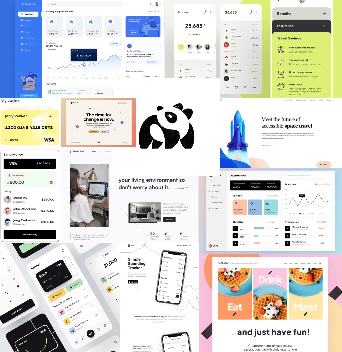
Mood boards
The first step to creating a brand vision was to explore visual ideas that resonate as playful, clear and trustworthy.
The following mood boards each have their own theme, which bits and pieces were inspired from to creative the overall ‘Vault’ brand.
Playful
Here you’ll see examples of products that have a playful element to them through use of colour, animation or shape. However, it was key not to go too playful, remembering I was designing a financial app.
Rounded rectangle icons are playful, yet clear and visually descriptive.
Bright, pastel colours offer a playful, yet serious tone that isn’t too distracting.
Animated icon states add a bit of fun to the apps, while also offering extra clarity and a more intuitive design.
Typefaces with rounded edges are softer and give a less intense and more light feel to the apps.

Clear
Here you’ll see examples of products that leverage white space and clear typography to make their designs easy-to-use. When in the business of dealing with people’s money, it’s imperative to present their info in a clear and uncluttered way.
The clear CTAs to transfer or request money are easy to understand and not easily missed for the key CTAs a banking app would need.
White backgrounds with light grey boxes that are just enough to make information stand out looks clear and sleek, but the gradient may be a bit too much.
Cards only showing high level information, but having the option to view more offers a clean UI upfront, but without losing any information or use for the customers.
All the typefaces are simple and extremely legible, but still have soft curves to not look too intense.
Trustworthy
Here you’ll see examples of other companies whose products convey a sense of trustworthiness in their presentation. I looked into other brands that require trust for their business to run.
This included brands such as:
Weight loss and exercise apps,
Security apps, and
Way-finding (travel and hiking trail) apps.
These examples offer:
Simple, clear icons and labels to match for extra clarity.
Minimalistic designs with only essential information and all visuals having a clear purpose.
Modern designs that look as up-to-date and high tech as possible.
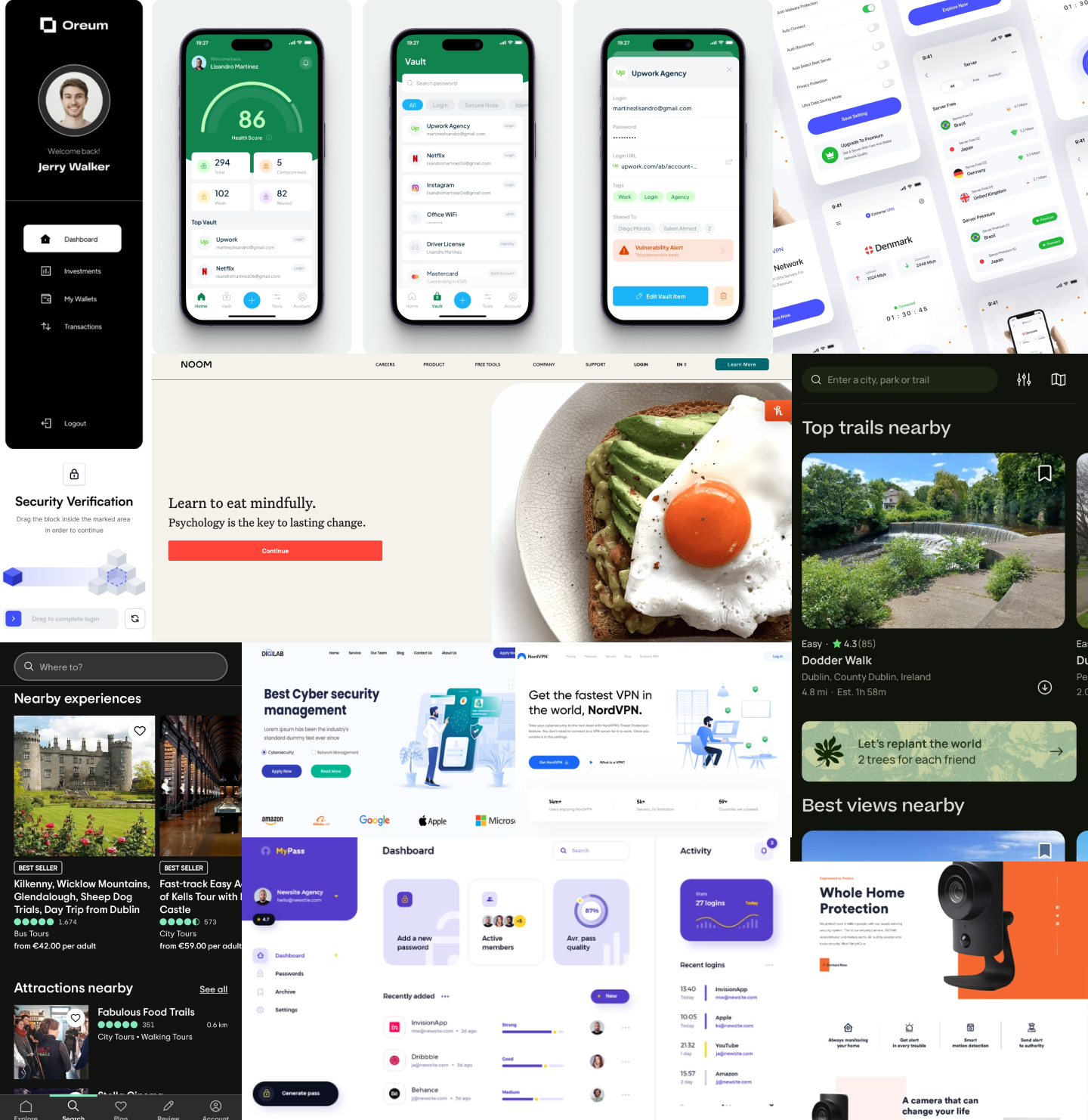
UI elements & interactive states
Here you’ll see examples of UI elements with different interactive states of form fields, buttons, tables, menus and graphs – which are all components relevant to my designs. I considered the visual treatments used to communicate different states and how I can use them to promote clarity in my own designs.
The hover states with a shade darker colour is nice and clear, and allows to have some playful input with colour.
Animated icons are interactive and playful, but could be too playful for a financial service.
Drop shadow hover states are great indicators with good accessibility and would be clear for the user.
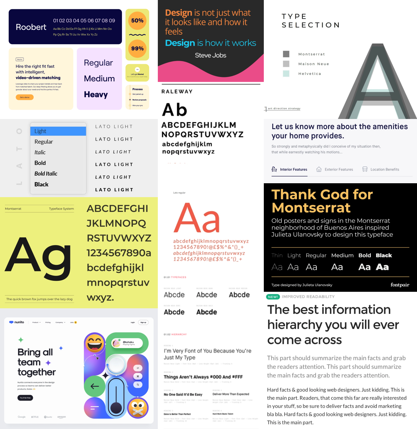
Typography
Here you’ll see examples of fonts that resonated with me as my brand values of playful, clear and trustworthy.
It’s clear a Sans Serif font is the best option for a clear and trustworthy app, and the clarity of the font allows for playful aspects to be incorporated in alternative ways.
Fonts have personalities, and the one to choose should match the brand tone without being distracting.
Finding a font that suits various weights is important knowing the app will be quite text heavy.
Rounded edged fonts are clear, but they can have a playful tone to them depending on the surrounding UI.
Colour Palette
Here you’ll see examples of colours, shades and shapes used effectively to promote a brand tone of playful, clear and trustworthy.
I was drawn to the oranges and pastels when thinking of the brand tone. These colours feel vibrant and fun to be used sparsely, and the shade used can allow them to be more serious with a pop.
The pie chart with various shades of blue is great for accessibility while being visually appealing and interactive.
With the bold choice of colour, I would need a lot of white and grey space to balance out the screens. The beige screens don’t feel clean enough for a banking app.

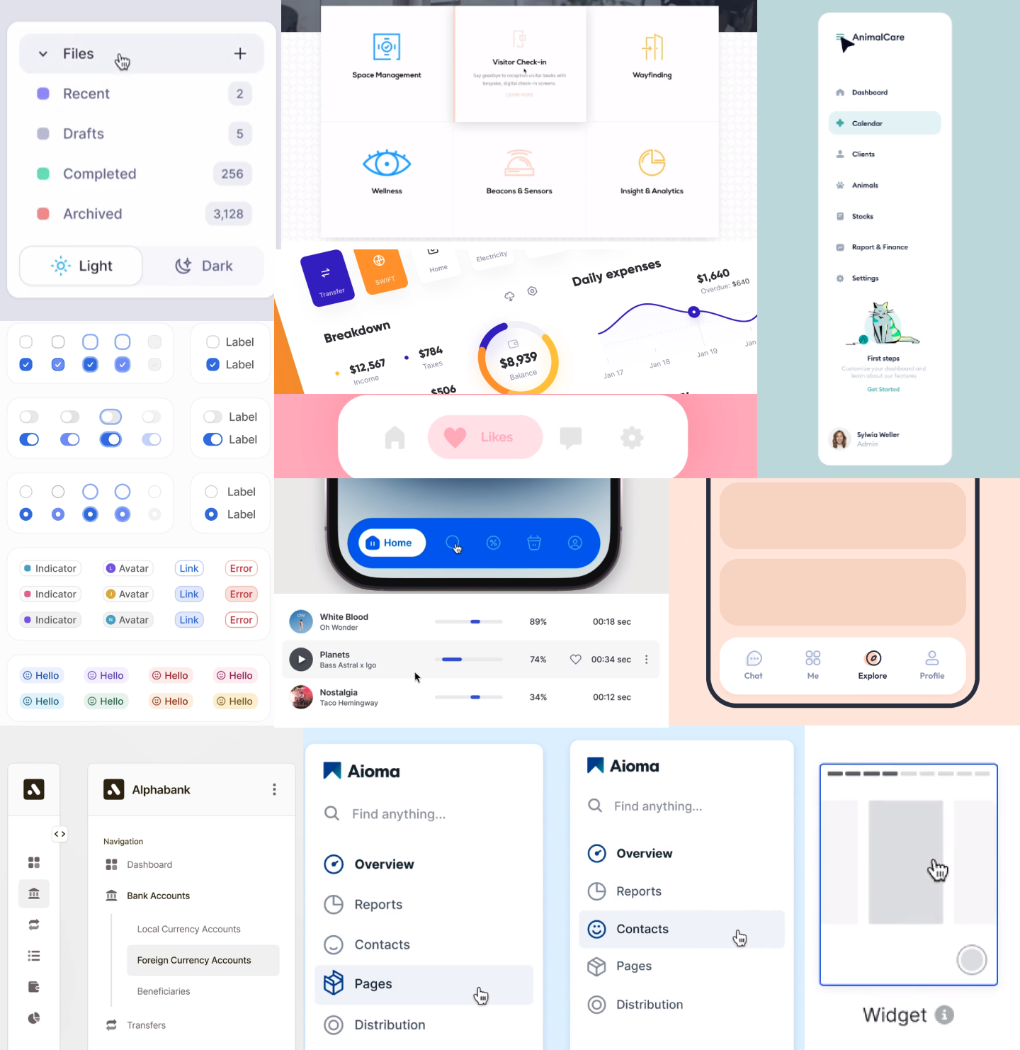
Iconography
Here you’ll see examples of effective uses of iconography in websites and mobile apps that resonated with me as playful, clear and trustworthy.
Being able to be more playful with icons by balancing the UI of the typography and colour palette is a nice way to add that bit of playfulness with an interactive item.
While the animated icons are nice, they feel a bit too playful even if the rest of the UI focuses more on clear and trustworthy tones.
The plain icons feel too minimalistic, but are the most clear and the hover and selected states can offer more playfulness in that area.

2. Ideate
Brand name & logo
After my discovery, I began ideation for a banking app brand with a playful, clear and trustworthy tone. I considered various banking-related real life items, including a piggy bank brand, but thought that would be too playful.
I landed on ‘Vault’ and designed the icon from scratch, matching the Phospher Icon set I had already selected.
I chose the icon and name because:
They are banking related and clearly recognisable,
The icon is clear and trustworthy, but with the orange offers a bit of playfulness, and
The word vault is clear and trustworthy, but also short and easy to remember and fairly leading about the services the brand offers.

3. Design system
Typographic scale
Good typography is fundamental to UI design, and for a financial service that will have many numbers on its screens, it’s even more important to offer a clear and easy-to-read font for customers.
After researching UI designs and fonts that fit within the brand values of playful, clear and trustworthy and exploring Google’s Material Design and Fontpair for a couple fonts that fit the look and feel I was going for and worked with each other, I created a typographic scale comparison sheet. This then allowed me to pick the typographic scale I felt best suited the UI design I was looking to create.


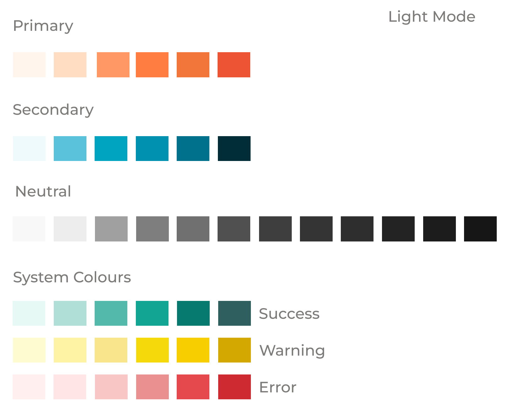
Colour palette
Colour and shape play a big part in conveying a brand’s personality in a UI design. After gathering references of colour and shape used effectively by other brands with the brand values of playful, clear and trustworthy, I explored various colours on to create a colour palette using Adobe Color.
I wanted to be sure to choose colours that:
The primary and secondary colours complimented each other while also considering accessibility from the very start to ensure the colours selected offered various shades that would be clear for all users.
The colours would compliment and ‘pop’ compared to the neutral colour palette I started with knowing that I would be utilising a lot of white space for clarity.
The system colours stayed consistent with social norms that would be easily recognised, such as red for danger, without classing with the primary and secondary colours.
Worked in both light and dark mode.

Iconography
Iconography and imagery can have a big impact on a user interface. After exploring various icon sets and comparing the iconography with the typography and colour palette, I settled on a fairly standard icon set using Phospher Icons.
I chose this icon set for a few key reasons:
While simple and clear, the icons offer a bit of a playful tone with their rounded edged and slightly thicker lines.
Phosher Icons offered a large library with various options for each icons that would potentially require use, but while also remaining consistent in use of shape, line weight and corner radius.
The more minimalistic the icons, the more opportunity to explore more interactive and playful hover and selection states.
The icon set looked great and clear in both light and dark mode using the selected colour palette.


Component library
While the component library itself sat in the design system at the end of the project, these components were iterated throughout the process of the designs and the component creation was embedded as part of the overall designs. This was because I found while putting screens together, adjustments were required to balance the screens.
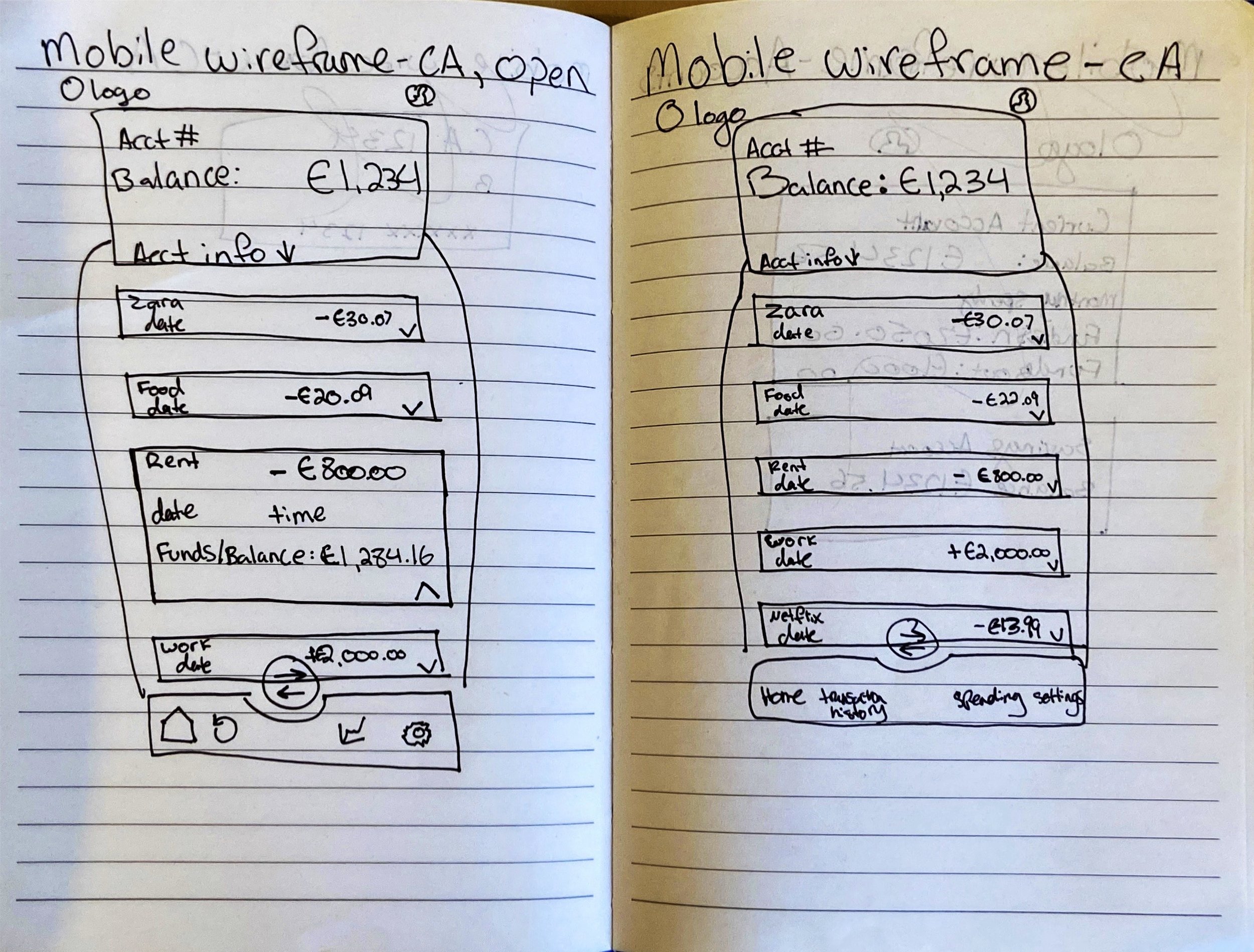
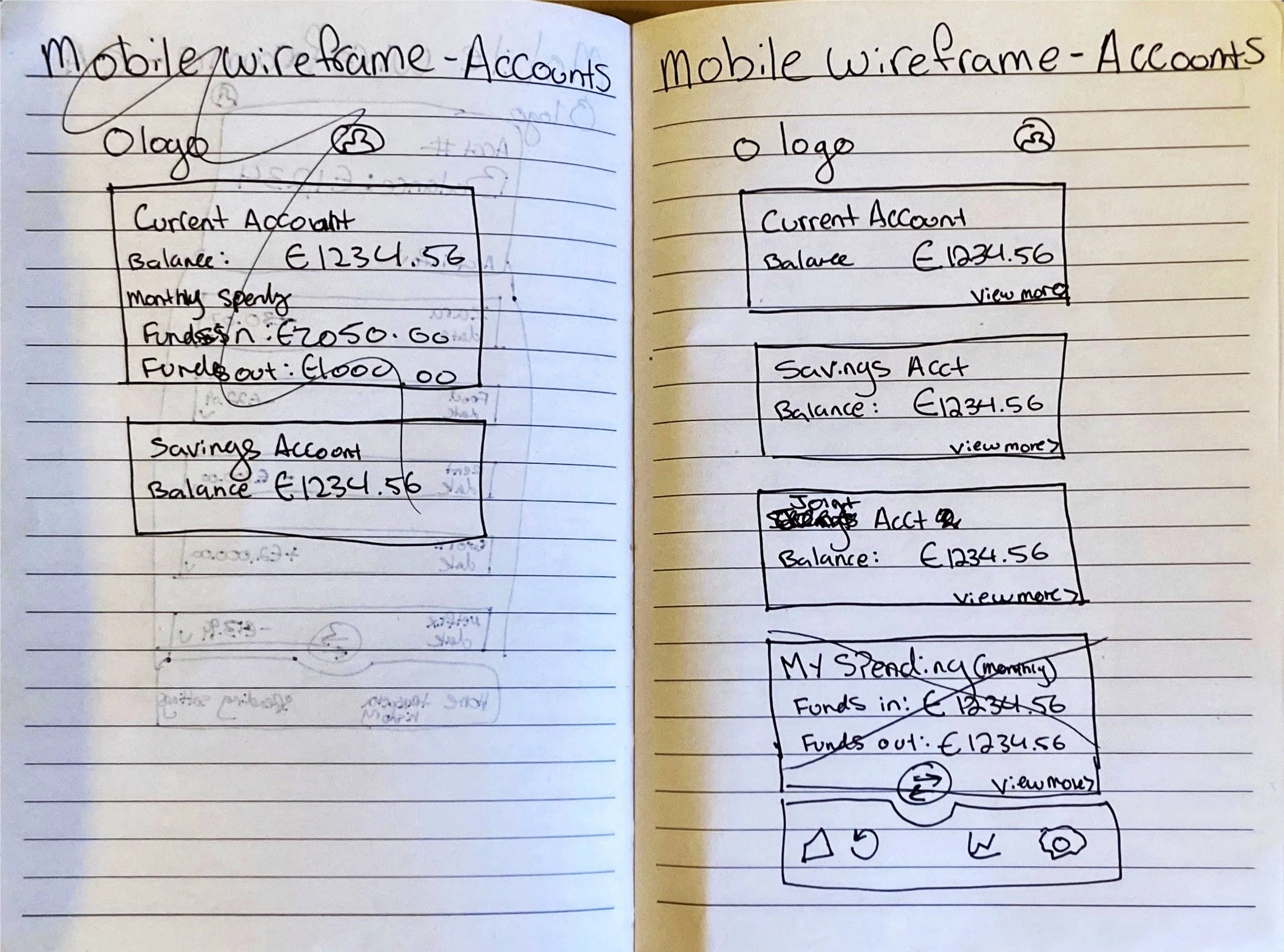
After sketching low-fidelity wireframes, I had a better idea of the types of components I would be looking to use in the Vault app.
The navigation bar allows for the key CTAs a customer would be looking to use in a banking app, including request/send money, view accounts, view transactions, view spending, and manage settings.
The cards represented a virtual version of the customers’ physical cards for an easy-to-understand design that resonated with users.
The expandable and retractable transaction cards allow for the high level information to be kept on the screen without an information overload for users, but allowing customers to check on specific transactions they’re interested in.
Using the status pills offers a ‘pop’ on the screen to let users know if their payment has gone through or not.
The ‘My spending’ bar graph and pie chart are visually friendly alternatives to the customers spending statistics that give an overall estimate that is easy to digest for customers.

Interactive states
Similar to the component library, the interactive states were iterative throughout the project as the design iterations developed and changed over time.
I opted for fairly straight-forward hover, selected and unselected states with colours and shades as the strongest differentiator

4. Design
Sketching
Good information architecture ensures that customers can quickly locate what they need, making their experience smooth and enjoyable. Looking at the information architecture allowed for us to strip back the existing journey of the AIB Security Centre and replan the page layouts and navigation so that people can easily find their way around. It involved organising and structuring the existing content in a logical way, making the journey more intuitive.

High-fidelity designs
As mentioned above, I explored many iterations of the high-fidelity designs throughout the duration of the project.
I found it important to keep each iteration, even if I had a small tweak, for ease of comparison, proof of why some design items were chosen over others and for my own knowledge of what I had explored as an option.
I started each of the three screens from the mobile size view because the screens were content-heavy and I found it better to start with the smallest screen first to ensure everything absolutely essential fit into the mobile view. I then worked on the desktop view and last worked on the tablet iteration as a combination between of the components used in mobile and desktop.


Feedback and design changes
Once I felt my designs were in a good place, I submitted them to be presented and shared with the wider student base in our next critique. I received feedback from fellow students and one of our advisors.
Overall, the feedback was very helpful and all surrounded around looking at my designs and asking “What can I take away to simplify this?”
Key changes from the feedback include:
I changed the selection states on the navigation bar. At first they changed colour, had a dot and glowed when selected and I was advised it was too busy, so I scaled this back.
I stripped back on the drop shadows I was using on the buttons and cards, and to use these effects more sparingly to make them stand out more when they are used. Instead, I opted for different colours as button states and minimised the drop shadows on the cards.
I fixed a few spacing issues to give the design more room and padding overall.
I reduced the size of the icons to make them less heavy on the screens.

Final design
Challenges
Some key challenges I faced throughout the project include:
At first I struggled to get a vision for my brand. I second guessed my colour palette quite a bit and was hesitant in my use of white space and whether it was enough or too much at times.
It was more difficult to utilise some design principles over others. For instance, the grouping/chunking and typography hierarchy were difficult to pin down due to the heavy text required on the pages of a banking app.
I questioned whether my designs were responsive enough, as each varying screen size required a fair amount of iterations to suit the new screen size and I wonder if this would’ve made developing the app difficult.
The mobile-view bar graph was the biggest challenge of all the components. It was tricky to get enough space for easy viewing and the spacing often felt too close together or too large for the screen.

Reflection
As my first UI design project, I am overall proud of the work and effort I put into this project.
However, having more experience as a designer now and reflecting back on this piece of work, there are a few items I would go back and adjust.
Some key positives:
I think I did a good job of utilising the feedback provided to simplify the screens for a more minimalistic look and feel in terms of colours, interactive states and drop shadows.
My use of corner radius variations within different components to bring out a more playful feel to the app added a playful edge to the character and tone. I kept consistency by halving my radius of any components that sat within another to make them look aligned and keep structure without making the edges too soft.
My choice of fonts and consideration for numerals and monospacing was clever and fit well with the curved radiuses.
I am proud of my use of the 8-point grid and columns to keep everything neat and clear-looking in my screens. I felt this was the core to making my designs feel clear and trustworthy and allow for the pops of playfulness to shine through.
Some things I would do differently:
I would have started off with much more white space in the designs and focused on better spacing, giving the typography more room to breathe within each component.
If I had more time, I would have experimented with alternative colour palettes and branding ideas and compared various designs before selecting one.
I would have labeled all my layers and components while creating the designs. Being my first project on Figma, I was not accustomed to labelling while I go, but I certainly would have changed that if I could go back to keep my designs tidier and easier to navigate for myself and other designers.
If I had more time, I would have also liked to experiment with more animations and interactions that, at the time, were above my design level and wouldn’t have been well suited to learn under a time crunch in order to enjoy and have fun with these design principles.