
Zippay
AIB Personal Mobile App
Overview
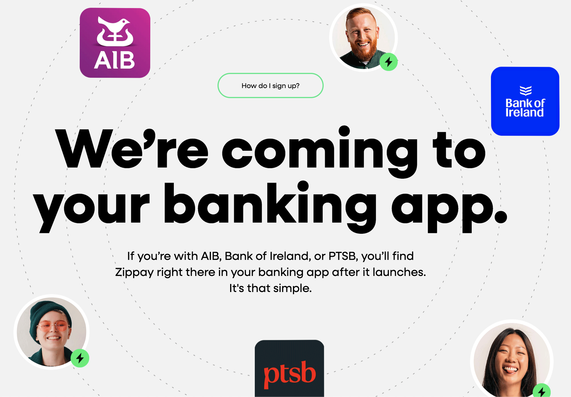
The three core Irish banks set out to launch a nationwide instant payment solution to compete with the fintechs emerging in the Irish market. The goal was to take a somewhat clunky existing system of entering IBANs to make bank transfers simpler, quicker and effortless while remaining equally as secure, in turn, increasing the total value of payments per month within the service and decreasing the total volume of payments going to third party apps (i.e. Revolut) .
As the lead designer for AIB payments, I worked with our internal, cross functional team, the other two banks, the Banking and Payments Federation Ireland (BPFI) and all legal and compliance stakeholders to craft a seamless mobile experience that reimagined P2P transfers for AIB customers, solving key user frustrations and frictions around IBAN entry and instant payments. The Zippay service will be available for the 4+ million users in Ireland between the three banks, 2+ million of those users of which will be through AIB.
Due to timelines and external commitments, the Zippay app was required to go live a few months prior to the new AIB app launching. This required Zippay to be designed and built for both the old and new app in different look and feels and with major entrypoint discrepancies.
Role
Tools
Timeline
Lead UX/UI Designer through the end-to-end process: discovery, information architecture, wire-framing, design, prototyping, user testing and iterations throughout testing and build.
Figma
Lookback
Dovetail
Jira
Overall: 2 years
Zippay for existing AIB app: 18 months
Zippay for new AIB app: 6 months
Problem
Using IBANs for P2P payments is slow and inconvenient — they’re long, hard to remember, and prone to errors. Additionally, the want for instant payments is key priority identified by customers because they don’t want to be checking if the money has arrived days after the transaction was initiated. They want the money with the person they owe it to or vice versa, right away.
This makes quick, casual transfers feel cumbersome and less competitive compared to modern fintech payment services.
Solution
Make P2P payments faster and easier for the customer, regardless of which Irish bank they belong to by reducing friction and allowing for a more secure, yet simpler payment details journey.
By removing the need for an IBAN, the customer simply needs the person they’re looking to pay’s mobile number or QR code to send a payment that will arrive instantly in the recipient’s account.
This removes the concerns of money taking long to arrive in the recipients account and security concerns of sending the money to the wrong IBAN.
Key consideration
A core item I needed to consider going into this journey was that Zippay needed to be designed for two different apps because AIB was also working on a new mobile app in tandem to the feature being built.
First, it had to be integrated into the existing AIB mobile app, where development and design work was intentionally advised to be kept to a minimum due to limited resources for the legacy app.
I focused on reusing established styles and components wherever possible, ensuring consistency with the current interface while reducing development overhead.
At the same time, the new app was being designed with its own refreshed look and feel.
This created a unique opportunity: while the initial Zippay designs for the legacy app had to remain constrained, the insights, user research, and learnings could then be applied to the new app, where we had more freedom to introduce new components, refine flows, and design without the restrictions of the older system.
This dual-track approach required careful planning and prioritization, balancing the immediate delivery of Zippay while also future-proofing the design for the next-generation experience.
Why wasn’t the feature released with the new app instead of doubling the work?
Timelines and deadlines were agreed between AIB and the other core banks and stakeholders. Therefore, while Zippay would be released in February 2026 within the legacy app, it would be re-released in an updated look and feel in the new AIB app release, which followed a few months later.
Process
Discover
Branch intercepts
Branch intercepts include talking to customers in one of our bank branches about an idea or concept, and even showing them a mock up of the idea on the spot.
We used these intercepts at The Lab in Dundrum, Dublin, to get gut-reaction feedback before fleshing out the journey details. It let us see right away if people understood and liked the idea of sending money by their mobile number, spot any confusion early on and make quick tweaks before investing time and money in development.
Overall, users were very familiar with the idea due to competitive fintechs locally and globally and expressed the desire for the quicker, easier form of payment with AIB.


Peer analysis
Completing a peer analysis allowed for us to compare ourselves to others banks and fintechs to look at how similar brands are handling easier, instant P2P payments.
From our peer analysis, we identified that mobile-number payment journeys are faster, more intuitive, and have higher adoption rates, with users valuing simplicity, minimal data entry, and instant confirmation compared to IBAN-based transfers. Providers globally have already set the expectation and the first impressions of this concept is that it is already a basic expectation from the user.

Industry considerations and challenges
The goal of Zippay was to create a competitive P2P service with fintech, like Revolut. Naturally, this required collaboration with competitor banks that were facing similar challenges.
This led us to a radical approach: a collaborative effort among Ireland's three largest banks to create Zippay.
A primary consideration and challenge here was to find balance in keeping our competitive edge, while also collaborating cohesively with the other banks to create a unified-feeling platform that leveraged our collective customer base and existing trust.
This brought significant challenges, such as:
Navigating complex legal and regulatory hurdles
Aligning disparate internal systems and security protocols
Fostering a culture of cooperation among teams that were historically rivals
This required us to redefine what a competitor was, shifting focus from a zero-sum game to a shared mission of retaining and serving our customers in the face of a common threat.
Define
User story map
Building a user story map allowed me to break down the big picture of how customers interact with Zippay.
I mapped out the Zippay journey starting at high level activities and diving deeper into clear, user-focused, actionable steps and goals within each journey, including:
Enrolment
Promotion
Send money
Send a request
Respond to a request
Pay with a QR code
Split a payment
Account management

Structuring the journey this way help me visualize and prioritize features throughout the full Zippay experience, define the minimum viable product (MVP), and ensure we addressed the most critical user needs first.
The story map also served as a shared reference point for the product and engineering teams, aligning everyone around user goals and the overall flow of the experience.
Context scenarios
Creating context scenarios allowed me to:
Put personas and real life scenarios to the journeys and understand any remaining potential needs or issues.
Highlight the convenience and value of the service in everyday life and demonstrate how Zippay solves a problem for our users to the business stakeholders.


Ideate
User flows
To help translate the user goals into seamless digital experiences, I laid out detailed user flows for the core journeys.
These flows outlined every step a customer would take — from landing on the homepage, to browsing contact lists, to submitting the payment and checking its status.
By visualizing the decision points and pathways, I was able to streamline interactions, identify overlapping areas across journeys and note potential friction early on. This helped to ensure that essential tasks felt intuitive and efficient.

Sketches
Before moving into wireframes, I began with quick hand-drawn sketches to explore different ways users could navigate core tasks.
These low-fidelity drawings allowed me to experiment rapidly, test multiple ideas side by side, and incorporate factors, such as existing AIB mobile app look and feel and components and ideate new components to discuss with stakeholders.
Deliver
Wire-framing
Once I felt confident in the user flows and basic sketches, I moved to low-fidelity wire-frames in FigJam, where I could dive that little bit more into the detail of the screen structures and start considering where specific information really made sense.
These wire-frames allowed me to visualise various solutions without the restriction of existing components, so that I could then look through a lens of which low-fidelity designs were best for both the old and new app structures.
High fidelity design
After analysis of my low-fidelity designs from both a customer and business perspective for both the old and new apps, I was ready to start the high-fidelity designs. Due to timing and the need for the old app designs first, I began my high fidelity designs using existing components from our AIB Design System.
A key step I took while designing for the legacy app, yet keeping the new app in mind, was noting areas for improvement on the next time around. This allowed me to get a head start on where we can make the Zippay experience better for the customer as we go.
Prototyping
After many iterations and stakeholder reviews and discussions of the high-fidelity design, I create a prototype on Figma for user testing on key journeys myself and stakeholders had questions on.
Customer testing
Round one (April 2025)
Using Lookback to connect virtually with our users and Dovetail for note-taking, I completed user testing with the goal of understanding initial reactions to the designs within the AIB branding look and feel and identify any potential pain points.
Objectives
Can participants successfully find and easily navigate through the onboarding, un-enrolling and payment journeys?
Do participants understand what the service is and how it works?
Do participants feel secure making payments with this service?
Would participants use the service? If so, why?
Participants and duration
5 AIB customers aged 20-52
1 hour sessions
Device type
Mobile


*Placeholder brand name “Jiffy” was used due to legal and privacy restrictions before the official service announcement.
Round two (May 2025)
After feedback and iterations from round one, retesting was completed in the search for any remaining pain points.
Objectives
Identify any outstanding potential design issues after initial feedback and iterations
Re-test communications letter after major restructuring of the letter
Participants and duration
5 AIB customers aged 20-53
1 hour sessions
Device type
Mobile


*Only feedback that was not previously collected and shared in round one was included in round two.
Final design (part one)
Design changes
Being an iterative process, user testing identified a few areas for improvement.
This included:
Updated wording in any pain points where content was causing confusion or lacking clarity
Added notifications to help direct users to the Zippay hub when an action was needed
Updated signposting to help guide new customers on their first visit to the hub
Incorporated a more prominent colour scheme for request statuses (i.e. pending, paid, declined, etc.)
Updated information pulled when a number was not in the user’s contact list to provide further clarity and security
Advised the communication team to change the letter vastly due to negative reactions and confused interpretations
Final designs (part two)
Challenges
Some key challenges faced throughout the project include:
Working with contracted developers. The development team was brought in specifically for this project and had limited familiarity with AIB’s existing platform. This required extra effort in documentation, walkthroughs, and collaboration to ensure smooth handover and alignment across design and build.
Working with competitors. The project required a delicate balance when it came to competition. On one hand, AIB and other Irish banks needed to collaborate around Zippay to stand against a common competitor, Revolut. On the other hand, we were bound by compete regulations in the Irish banking sector, which limited how far collaboration could extend. This meant our designs had to account for both alignment with broader industry standards and the need to differentiate AIB’s own offering within regulatory boundaries.
Designing for two app ecosystems simultaneously. Redesigning and new journey mapping were required to prepare for the upcoming AIB app release. While Zippay first had to be integrated into the existing app with minimal new design work, I was able to reuse my research, stakeholder communications, and user maps for the new app’s updated look and feel to minimize duplicated work.
Reflection
Looking back on the project, Zippay was a unique project that allowed me not only to create a truly useful feature that I believe in as an AIB customer myself, but also to grow immensely as a lead designer managing a large scale project in two app ecosystems.
Some key positives:
Successfully balanced delivery for the existing app while shaping the future redesigned app.
Built strong relationships and collaboration across stakeholders, developers, and the wider banking sector.
Efficiently reused research and user maps, saving time while still driving meaningful insights.
The overall growth I experienced as a designer, leading out on design in such a large scale across the Irish market.
Within 2 weeks live, 2.4 million payments were made using Zippay through AIB, with AIB leading the market on Zippay payments throughout Ireland.
Some things I would do differently:
Hold early alignment workshops with developers and understand their ways of working to reduce friction between AIB and EPAM WoW during handover.
Create a more systematic design rationale documentation to support all future iterations with clear decisions made by who and why.
If time permitted, I would have liked to build out the designs for the new app first, which would have allowed me to start at the optimal customer experience for the new app and then work my way backward to what development restraints would allow for the legacy app.